Testing Bing: The Final Verdict

So after all these articles about Google and Bing, what’s the final world?  Well, it now comes down to to personal preference.  That’s not a non-answer; it’s a huge change.  A year ago, there was no reason to ever touch anything but Google.  Now, there’s a real contender.

Sure, the results aren’t quite as good.  Yes, Microsoft still has work to do to fix a few stupid oversights and tie things together a bit better.  But not only is it a decent substitute, but there are now certain types of searches and certain features where, quite frankly, Bing beats Google hands down.

And even if you unequivocally prefer Google’s results, there’s still a really good reason to root for Bing: competition.  Everyone loves to hate Microsoft: the big, evil, money-grubbing monopoly that rules the computing world with an iron fist.  But these days, it’s not much of a monopoly: for every product Microsoft makes, there’s guaranteed to be an entirely viable alternative.  Sometimes these alternatives are free (looking at you, Ubuntu and OpenOffice), and other times they’re perceived as ‘superior’, either for good reasons (hi, Nokia) or not (hello, Apple).  People trust Microsoft like they trust Snap-On: they make good – if somewhat overpriced – tools.  But they’re just tools.  If something goes wrong with one tool, you replace it with another.

Google, on the other hand, is far more frightening, for they peddle information.  Many people out there trust Google for not just searching the Internet, but also with running their e-mail and chat and contacts and calendaring (Gmail), saving their documents (Google Apps), entertaining them (Google owns YouTube, not to mention Google Video), teaching them (Google Maps, Google Books, Google Scholar), informing them of current events (Google News), and even handling money (Google Finance).  They run an advertising empire the likes of which has never been seen before, and through Google Analytics (a free tool used by many webmasters, including us) and people clicking on their search results pages, they know with astonishing detail who goes to what web sites, what they read, what they type, and who they are.  Every future dystopia we’ve dreamed of has an evil mega-corporation running the universe (SkyNet, OCP, Global Dynamics), and in real life, Google comes closest.

I’m not saying to dump Google in favour of Bing – it’s nowhere near that good.  But consider it another tool.  You might want to set Bing to be your home page and keep Google as your default search provider (or vice versa) so you don’t ‘forget’ about one or the other.  That way, both tools are handy when you need them.

Because ultimately, that’s all these are: tools.  One just got better.  That’s never a bad thing.

Testing Bing, Part 3: The Experience

So I’ve talked about the quality of search results returned by Bing and Google.  I’ve gone over their features in depth.  But there’s one more element that should be considered: the overall experience.  How well is everything tied together?  How easy is it all to use?

We all know and love Google.  The UI is very simple.  It’s not particularly pretty, but it is easy to use.  Everything you’d want to find somehow appears exactly where you’re looking for it.  The lack of clutter brings the focus to what’s important.  People love Google because it keeps all the complexity away from you until you reach for it.  Sometimes, it almost feels smart.

Bing, on the other hand, just doesn’t get this.  The home page is fine.  It’s pretty, it reveals the various search types and features available, it gives you something interesting to look it, and it keeps the focus on your search.  But once you actually run the search, everything falls apart.

Why exactly does Bing behave so differently in different regions?  Try setting your region to Canada, and Bing is an entirely different animal than, say, United States.  The British site is again different.  They all expose different features, they use different layouts, and quite simply, they work differently.  This is confusing.  It’s also rather dumb: the rest of the world matters these days.

It’s great that Bing can suggest related searches for me.  I appreciate it.  But look at all these places and ways it does so:

  • Main categories along the top left, emphasized with color.
  • “Similar to this” links at the top right.
  • “Related Searches” at the left.
  • “Search history” at the bottom left.
  • Seemingly random links through the body of the results.

It’s baffling!  It clutters things up, and it gets in the way of my results.  Often, Bing will even run a few of these related searches and display the first few results.  Again, this might sound good in theory, but in real life, I now only get to see three or four results for what I actually searched on, and then the rest of the pages are basically Bing running amuck, wandering around doing what it feels like.  Where’s my control?  I’m running this search, I want Bing to do what I tell it to!

Another question: why are pictures displayed at the top and videos displayed at the bottom?  Why do you sometimes get only pictures, sometimes only video, sometimes both, and sometimes neither?  Why do image results use a slick ‘infinite scroll’ feature, but videos (and everything else) uses the old-school ‘Next Page’ routine?  Why do some search results have summary info at the top (such as flight status) and some results have it at the bottom (such as company details)? Why are additional links for a particular result sometimes displayed in a list under the result, sometimes one one line, and sometimes buried in the popup? What’s the deal with the search categories on the left… are they more ‘suggested searches’?  Links to other types of Bing searches?  Links to Wikipedia?  All of the above?

Basically, Microsoft is so busy cramming everything they can think of into Bing that they forgot the first rule: make it easy.  Often, I really have no idea where I’m supposed to click, or find my results, once I run a search.  Sure, it only takes a moment to figure it out, but you know what?  It only takes a moment to switch to Google, too.  And guess what I’m more likely to do?

Yes, Google has its problems, too… but nothing so bad as Bing.  It’s too bad, really… Bing has the results, the features, a nice UI, and pretty much everything needed to be a great competitor to Google, but Microsoft just didn’t tie it together.

The verdict: Your call.  Ultimately, you need to decide if you prefer a utilitarian 90’s style UI built by programmers (like Google) or a snazzy, modern, distracting UI built by committee (Bing).  To be honest, somewhere right in the middle would be perfect, but I’m still waiting for that one.

Testing Bing, Part 2: The Features – Everything Else

And then, we get to the areas where there aren’t direct comparisons. Google has a lot more going for it than I’ve shown so far. There’s Book Search, Google Scholar, Google Finance, the translation service, and a few other odds and ends. These are all really useful, valuable tools. I won’t detail them here, because anyone who cares has known about these for a long time now. Still, they work, and they work well. They matter. And Microsoft doesn’t have much of an answer to most of them.

But Bing can now say the same about a few things they alone offer. Have a look at their Travel results page for a particular route:

image_thumb[61]

There’s a wealth of information here that’s never really been brought together like this before. Right away, I see how much this fare is going to cost me today and whether the price is likely to go up, down, or hold steady. I can see prices by day on a simple calendar view, I can see the history of lowest fares on a graph, and – of course – I can search for specific flights. This is huge. And there’s a similar breakdown for hotels:

image_thumb[63]

This is not too different than the many travel-oriented sites already out there, but there’s one key difference: Bing is focused on informing you, not selling you. Bing also brings some really nice intelligence to a variety of searches. Google does the same, sometimes (like flight status), but Bing goes further. How about a search for a Mazda 2? Or malaria? The size of Alberta?

image_thumb[67] image_thumb[69] image_thumb[71]

This is really helpful. Rather than scour through web pages, the information you wanted is right there.

The verdict: None. Luckily, you don’t have to choose. Want to search through books? Use Google Book Search. Want to find a cheap flight? Use Bing. Until one search engine eclipses another here, there’s really no reason to choose one. Use the tools that are out there.

Testing Bing, Part 2: The Features - Shopping

Google has had shopping tools for a long time, but they haven’t really been particularly popular – or promoted. Now Bing joins the game.

image_thumb[57] image_thumb[59]

They both do the basics: you type what you want to buy, and you see a list of products, along with description, price, and reviews. They both let you filter your results by price ranges, brands, and so on. They both let you see price comparisons for a particular product, and they both offer details like tech specs and so on.

Bing keeps going. Bing lets you sort your results by either user or expert ratings. The resulting order seems to be more accurate than Google – on my example (plasma TVs), Bing has clear market leaders Pioneer and Panasonic firmly at the top, while Pioneer is nowhere to be seen in Google’s top picks. Bing also breaks down popular features (in this example, Picture, Sound Quality, Ease of Use, and so on) and lets you rank the results accordingly. There’s Bing’s Cashback feature, but I’m not convinced this is much more than a gimmick, so I’ll leave that for now.

The verdict: Bing is slightly better in features, presentation, and ratings. Google is a strong contender, though.

Testing Bing, Part 2: The Features - News

Bing and Google both have news searching, too. The results are about similar. They both have pretty similar features.

image_thumb[51] image_thumb[53]

Google offers more tools to narrow down your results – particularly, by limiting by date. This seems like a pretty glaring omission on Microsoft’s part for a news search. Bing’s Related Searches tool is very helpful here, though… it’s kind of like a ‘News Topics at a Glance’ for your search term.

Both engines also offer a news overview page. Google wins on content here – lots of news, broken down into nice, easy to read categories, with plenty of customization if you want it. Bing fights back with their video previews. With the auto-play, this is a lot like having the video segments of the day’s news available for you to see or skip as you like.

The verdict: Google wins. Bing brings some nice stuff to the table, but between Google’s better search tools and a news overview page is much more informative and easy to read, Bing falls behind.

Testing Bing, Part 2: The Features – Maps

Bing and Google both have map search. They’re both really good.

image_thumb[43] image_thumb[45]

In this example, Bing knew exactly what to do with my search, and Google had no clue. I’m not quite willing to admit that Bing has the upper hand on search here – there are times that Google is smarter – but Bing certainly isn’t worse.

In terms of map coverage, Google and Bing are roughly equal. Some places are better covered by one service, some by the other. They’re both aggressively improving this. Google has Street View, Bing has Bird’s Eye. Bing has 3D mode, Google has Google Earth. They both have nice UIs here.

What more can I say? This is a huge area, and is used by many people. They both provide a huge feature set here – I’m still kind of amazed this is all free – but they’re so similar that it all comes down to personal preference. I probably prefer Bing’s UI, but I can’t really justify why.

The verdict: Tie. Pick whichever you like. If it’s not working for you, then try the other.

Testing Bing, Part 2: The Features – Video Search

Bing and Google both have video search, too. They both work:

image_thumb[35] image_thumb[37]

But again, Bing outdoes Google. Bing presents a beautiful – and useful – grid view of search results (or, if you prefer, you can switch to a details view). Google has a weird mix of search results, video preview, related videos, options, and more. It doesn’t work very well. And perhaps most importantly, you can only see a third as many of your results at a time as in Bing. And isn’t that why you came here?

Bing has a great video preview mode, where you can see the video play (with sound!) as you hold your mouse over it. This has proved controversial since it lets people see porn, but I don’t understand why. Bing filters these results by default, and both Google and Bing let you see thumbnails if you choose to un-filter these results. Why is a static thumbnail of a boob okay, but an animated one isn’t? Whatever. Apparently, Microsoft has fixed this somehow, anyway. What really matters is that this is a very friendly, useful way of offering video preview.

The page you get when you click a video to watch it is much better, too:

image_thumb[41] image_thumb[39]

Depending on where you click, Google will either load the video into the annoyingly small preview pane, or will take you to it’s player screen. Due to a bunch of information most people won’t care about by the time they’re watching the video, the actual player itself is somewhat cramped. Bing very rightly puts the focus on the video itself, orienting the page to allow for widescreen video in a nice big player. Thank you!

The verdict: Bing wins again. Come on, Google, quit letting your programmers design your UI.

Testing Bing, Part 2: The Features – Image Search

Bing and Google both have image search. The search results are about equal. They both work reasonably well, but both suffer from problems where the image you click on isn’t available. This seems to be more of a problem with Google, but perhaps only because Google is much more popular.

image_thumb[25] image_thumb[27]

But what a difference in how things are presented and how you can refine your results! Google has a few things you can tinker with – the image size, the type of content, and – oddly enough – the dominant color. I’m not sure why you’d use this, but I’m sure graphic designers ripping off other people’s images really like it.

Bing, on the other hand, offers all this and more. They have a beautifully organized layout that fits to your browser and offers ‘infinite’ scroll. They let you change the way results are presented – small, medium, or large previews, as well as a details view. They offer more – and more useful – controls for tinkering with your search results. There’s a ‘Wallpaper’ option available under Size which Google lacks, and this is a thing of beauty: only images the same size and orientation as your current monitor (or primary monitor, for us multi-display folks) are returned:

image_thumb[29]

This works so well that I almost wish it was integrated right into Display Properties. Normal people don’t care about resolution or aspect ratios, they just want to look at pretty pictures and click the one they like. Bing lets you do this. Google doesn’t.

There’s one other area where Bing beats Google, and that’s the page you get when you click on an image in your search results:

image_thumb[33] image_thumb[31]

Google has a pretty basic ‘here’s your image and here’s the page it’s on’ approach. It’s kind of a crappy compromise between keeping you in Google and letting you see the image’s page. It sucks at both. Some sites have even figured out how to get rid of the Google frame along the top, so you entirely lose your Google search tools. Bing, on the other hand, keeps you entirely within the Bing UI – all the usual tools and layout are there. There are very easy to find links to view the full-size image or the source page in their own window. The source page itself is presented inside a frame, so you can see it without letting it take over your browser. Perhaps most importantly, though, your results are still available on the left. Want to check out the next image? Rather than dealing with whatever shenanigans the source page has dealt you, clicking back, finding where you where, and then clicking the next image in the list, all you have to do is browse and click. Very nice.

The Verdict: Bing wins hands down, again. Google should really be ashamed of this one; their image search UI is beyond basic and into shoddy, while Bing really does bring some useful new tools to the table.

Testing Bing, Part 2: The Features – Result Preview

Rather than click on a result and see what you’ve found, it’s very helpful to be able to get a bit more information right from the search results page. Both Google and Bing both offer tools to help with this:

image_thumb[49] image_thumb[47]

Google presents a sort of Table of Contents for the search result, if possible. It will also reveal a few other helpful hints when it can, like the stock quote link here. Bing presents a similar ‘Also on the page’ section, although it’s hidden until you move your mouse over the result. Some results have links to the various sections on the page. You’ll also note that Bing presents me with the number for Customer Service; that’s a nice touch.

I’m not really sure which one is better here; it seems to depend on the exact search. They both try to go deeper into the page, with varying degrees of success.

The verdict: Tie. Neither engine seems to have a serious advantage here. They could both use some improvement.

Testing Bing, Part 2: The Features – Advanced Search

Once in a while, you want to be a bit more specific about your search.  Sure, if you really know your stuff, you can just add some special terms to your query, but for us humans, some UI would be nice.  They both offer it:

image_thumb[23]  image_thumb[21]

Unfortunately, they could both do with some improvement.  Google presents you with a dizzying array of options, with some not visible until you scroll down and click the ‘Show me more stuff’ link.  It feels a little like opening a door in a nicely finished house and finding a room with bare concrete and a single dirty light bulb hanging from a cord.  Microsoft organizes their advanced search options pretty well, using tabs that appear between the search box and the search results.  Very nice.  Of course, it’s easy to look organized when you only have half as many options to present.  Also, most people won’t find the Bing advanced options link right away: it’s tucked away in an easy-to-miss place on the results page, and doesn’t even exist on the home page.

Ultimately, Google takes the crown here.  Even though they’re not as nicely presented – or sometimes, not presented at all, just available if you happen to know the magic word to type – Google does have more flexibility in customizing your search.

The verdict: Google wins.  I guess.  But they both kind of suck.

Testing Bing, Part 2: The Features – Search Suggestions

Even though Bing’s search results are as good as Google’s, they are acceptable.  But while a decent algorithm might have been enough for a search engine five years ago, people want more these days.  Let’s take a look at what extra features Google and Microsoft both bring to the table.  I’m going to keep this specific to search itself; it’s great that Google offers me an online version of WordPad, but that doesn’t help me when I’m using their search engine.

The next few articles will be image heavy, so I’m going to use thumbnails.  Just click an image to view the full-size version.

When you begin to type a search query in either Google or Bing, you get a pop-up list of suggested queries:

image_thumb[4] image_thumb[12]

This is essentially IntelliSense for the Internet, and it’s very helpful.  The suggestions they offer are usually different, but are generally both equally useful once you type enough of your search terms, and equally useless until you do.  Google does have one shortfall here, though: auto-suggest only works from the main page – and in this case, it pops up on top of the ‘Search’ button – not a problem for us experts, but for some people, this will be very annoying.  The search box on the search results page doesn’t have this feature at all.  Since this is where people are likely to refine their suggestions, this is a dumb move.

Bing, on the other hand, does this very nicely:

image_thumb[17]

Not only do you have auto-suggest when typing, but Bing also offers a list of terms to help narrow down your search.  It works very well, and while I don’t see it being quite as useful to us technical types – if we wanted to read about WestJet’s fleet, we’d just have typed ‘WestJet Fleet’ to begin with – but for those who don’t live and breath Internet, this will be very helpful.  Bing also shows a list of related searches, your own personal search history (with easy Clear and Turn Off links for those who want to cover their tracks a bit), and over on the right, a list of sites similar to the ‘best match’ result.

The verdict: Bing wins hands down.  Come on, Google, this is an easy one to fix.

Testing Bing, Part 1: The Search Results

My counterpart recently wrote an article on Bing.  The verdict?  “Bing is all hype.”  A few minor UI enhancements over the same shitty old search engine, just painting the pig.  I disagree.  I’m going to examine and compare Bing and Google (because let’s face it: nothing else matters) in the three core aspects that really matter: the results, the features, and the overall experience.

The first, and probably the most important, is the quality of the searching algorithm.  If the results suck, nothing else matters.  Google excels at this, and for years, no one else has even come close.  They’ve built an Internet empire around this, and for good reason.  It works.  It’s the backbone and starting point of the entire Internet, from a user’s point of view, and it does this better than anyone else.  If Google.com goes down, most people (myself included) really don’t know what to do.

But you know what?  Microsoft is catching up.  Bing is no huge leap forward in search results – in fact, I suspect it’s the same core search engine that was Live and MSN before that.  It’s still not as good as Google.  But it’s not bad anymore.  I know: I have Bing as my home page, Google as my default search provider, and I use both of them frequently.  I generally prefer Google, but for the most part, it doesn’t make a huge difference anymore.

And I have proof: some kind soul has set up a simple double-blind experiment where you can test results yourself:

image

Until it got popular and “some douche” started gaming the system, results were split surprisingly equally between Microsoft and Google.  The number of people who preferred Google’s results (remember, this is a blind test; they’re picking the results, not the brand) varied from 36% to 43%.  Microsoft had between 31% and 38%, and Yahoo had between 22% and 29%.  Remember, if all three were equally good, they’d all be 33%.  That 5% difference isn’t really too big.

Perhaps more importantly: Bing is getting better while Google is getting worse.  This is, perhaps, inevitable: it’s hard to stay on top forever.  Google is the target of every slimy hack out there trying to get a bit of cash from having a useless, ad-ridden site pop up on Google, and generally the sites with real content are more concerned about working on their real content or doing their real work than they are fiddling with search engine rankings.  By the way, don’t forget to check out our ads and affiliate links!

Sure, there are a few places where Bing really sucks.  For example, searching for a valid URL should always, always return that page.  Normal people don’t know or care if they’re typing in a URL field or a Search field; they just want to go there.  Even technical people work this way: I love Google Chrome’s combined URL / Search box.  There’s no reason a browser or search engine shouldn’t be smart enough to tell the difference between a URL and a search query these days.  But I’ve also run into queries where Google returns nothing but ads and useless aggregator sites while Bing returns exactly what I’m looking for.

So, while it’s pretty clear that Google is still the winner, Microsoft isn’t really that far behind anymore.  It’s the usual old Microsoft strategy: start late, start shitty, and keep throwing money at the problem until you’re winning.  Like or it not, that strategy usually works, and it looks like it’s in the process of working here, too.

So, in summary:

  • Google is usually still better.
  • Bing isn’t too far behind, for most searches.
  • Bing handles URLs horribly – a huge problem, but one easily fixed.
  • Both Google and Bing almost always return clearly obvious ‘best matches’ first.
  • For real people, both Google and Bing are now perfectly adequate, most of the time.
  • Google and Bing return different results.  If you’re not finding what you want on one, try the other.
  • If you still use Yahoo, it’s time to pay your final respects and move on.

My verdict: Google still has the advantage here, but Bing isn’t too far behind – and it’s slowly catching up.

Next time, I’ll talk about the extra features Google and Bing bring to the table.

Is Windows 7 Really Checking For Drivers Online?

Windows 7 has an amazingly thorough collection of drivers available.  While some are built right into the OS, most need to be downloaded from Windows Update.  Depending on how you install Windows 7, this might not happen.  Particularly, if you don’t go along with all of Microsoft’s recommendations during setup (like turning on Windows Update and activating Windows right away), this can be a problem.

Often, it will appear as though Windows is checking online, but after a couple seconds, it will report that it found no drivers.  You might want to make sure this is true; it could easily be that it just didn’t find any drivers it’s allowed to download due to your current settings.

Here’s how to fix it.

First, activate Windows.  This never hurts.  Keys are free right now, so there’s no reason not to.  In theory, you shouldn’t need to do this, but I’ve encountered this issue a few times where activating Windows seemed to fix it.

Second, make sure Windows Update is turned on.  You don’t need to set it to automatically install everything.  I have it set to automatically download updates but let me choose what and when to install.

Third, make sure you’ve configured your system to allow driver downloads.  Go to System under Control Panel (the fastest way is WinKey + Pause/Break).  Then, on the left side of that window, you’ll see a link for ‘Advanced system settings’.  Click it and then select the Hardware Tab:

image

Click ‘Device Installation Settings’.  You’ll see a window like this:

image

If you have the same settings selected as shown above, you won’t get driver updates, even if you specifically choose to check online.  You can pick alternative settings if you want, but it really just makes sense to choose ‘Yes’.

Once you’ve done all this, make sure that Windows Update isn’t busy.  Finish installing any updates it’s working on.  Then, just to be safe, restart your computer (this shouldn’t be required, but certainly won’t hurt).  That should do it.

In theory, the second you save your changes in the Device Installation Settings window, Windows should automatically scan for drivers for any hardware that needs it.  Sometimes it even works.  If not, there are two ways of forcing Windows to check again.  The easiest, and probably the safest, is to just do another check for updates through Windows Update.  Any driver updates will be shown there, and you can install them just like any other update.

If you’d rather have a bit more control, go to Device Manager (click Start, right-click on Computer, click Manage, and then open Device Manager in the Computer Management window that appears):

image

Right-click the device in question and choose Update Driver Software:

image

Then, just click ‘Search Automatically’.  Windows should take care of the rest.  If you happen to have a driver – or you think you might, and want to see if it works – click ‘Browse’ and point it to the folder with your driver.  You can tell it to search subfolders, so don’t worry to much about picking the exact folder within a complicated driver package.  Generally speaking, Windows will install the driver if it finds one that works, and if it doesn’t, it won’t work anyway.  In theory, you can specify exactly which driver you want to use, but under Windows Vista and Windows 7, I’ve never come across a situation where this works.

If you ever have a choice, trust the Windows driver installation system over the vender’s setup program; they often do some pretty weird shit and sometimes install programs you really don’t want.

If your driver isn’t found online, and you don’t have a driver package provided by the manufacturer, you’ve probably come across some hardware that is going to take serious work to get running with Windows 7, if it’s even possible.  In this case, time to hit Google (or Bing?).  And good luck.

Choosing a Data Store

Regardless of what you’re doing, you’ll probably have to save some data sooner or later.  When you do, you’ll be faced with an incredible array of data technologies, all of which are clamoring for you to use them.  The data store you choose will define your entire project.  Choosing wrong dooms you to failure.  But until you’ve had a hell of a lot of experience – and made some horrible mistakes – it’s pretty tough to know what to pick.  Here’s some help.

The first thing you’ll need to decide is whether your data belongs in a file or on a server.  This is where a lot of people go wrong.

Files are great when the data is specific to one person and one place.  The data is saved in one file, an easy bundle to manage and understand.  Your data will be easy to backup, easy to send to other people, easy to copy and archive and transfer.  Everyone understands files.  If your program has a File Open command, you probably want to go with a file-based store.

But files have weaknesses.  They’re fragile – lose the file, and you’ve lost everything.  This is a bigger problem than you might expect: if your hard drive hiccups or if someone bumps your network cable or if your power goes out at the wrong time, you might lose everything.  They’re very difficult to share.  Security can be an issue – you’re pretty much at the mercy of the underlying OS.  They often don’t perform very well when there are many read or write operations on the underlying file.  And perhaps most importantly: it’s just a bunch of bytes.  It can’t do anything but sit there.

Servers, on the other hand, can do all kinds of amazing stuff.  In fact, it’s just about possible to write entire applications using nothing but a database server these days.  They’re great at coordinating data between many different people and places, usually have lots of flexibility when it comes to security, and often offer much more extensive feature sets than file-based storage.

But, they have their weaknesses, too.  Obviously, you need a server machine.  Maybe that’s just the machine your program runs on anyway, but even so, you’ll probably need to install some supporting software there.  They’re much more complicated to manage.  Since the data is exposed as a service, you can’t nicely bundle it up and e-mail it to someone or burn it to a CD.  And there’s often lots of overhead associated with the server.

Generally speaking, if you’re writing a program that just one person uses (at a time), and you’re working with easy-to-isolate chunks of data, use a file.  If you envision your program opening documents of some type, you’ll want to use files.  If you’re building a stand-alone program that will be installed on many computers, you probably want to use files.

If you need a bit more power, reliability, performance, security, or interoperability than simple files provide, then move up to a server.

Of course, most complex solutions support – or require – more than one type of data store.  Simplicity is good, but don’t feel that you have to keep everything in one place if it doesn’t really make sense.

I’ll be going into much more depth on this topic later, but for now, take this away:

Need a server?  Use Microsoft SQL Server.  This comes in so many flavours, something is bound to work for you.  From the full-blown Enterprise edition (or the virtually identical – to a programmer – Express edition available for free), to the file-based Compact Edition needing only a small DLL to run, it’s a good bet.

Need a file?  Perhaps SQL Server is overkill.  If so, use XML.  XML is very flexible, with a great tool set.  You can even go between a DataSet and XML with one line of code.  Another safe bet.  Be good: save it in an appropriate location under %AppData% or %UserProfile%.

Saving simple user settings?  Particularly the type that don’t really need to be saved or backed up, but merely offer convenience?  Use the registry.  But use it properly: save in the right place, and don’t save any serious amount of data.  If you feel you have too much data for the registry – or you just don’t like it – then save an XML file in %AppData%.  But still: don’t save anything here that the user might want to backup.

Of course, this advice is only valid most of the time, and as a developer you should know that a solution that works most of the time is worse than no solution at all.  Nevertheless, if you’re making a different decision, it wouldn’t hurt to take a moment and think about it again.

Windows® Internals, Fifth Edition

For those of you who aren’t familiar with him, one of Microsoft’s foremost leaders and a leading writer, Mark Russinovich, has written another book along with David Solomon and Alex Ionescu.

Mark has always been one of my personal favourites in the Windows world; he is a mentor to me and presumably to millions of other IT professionals out there. He is a technical fellow at Microsoft, author of the indispensable widely-used Sysinternals tools, and more notably the discoverer of the “Evil” Sony rootkit that permanently turned me away from Sony products. His expertise in Windows is unparalleled.

The book promises to give both developers and system administrators an in-depth understanding of the Windows kernel and will foster effective troubleshooting and smooth operation of any Windows platform. The book will focus on Windows Server 2008 and will hence be applicable to Vista, Windows 7 and any other release that is built on the NT 6.0 kernel.

Windows® Internals, Fifth Edition

Windows Internals: Covering Windows Server 2008 and Windows Vista

In addition to this, there are hands-on experiments throughout the book that will allow the reader to witness some of the theoretical paradigms presented first hand.

The book is set to release June 17, 2009 and I am going to be one of the first to snap up a copy. Suggested retail price is $69.99 and of course the knowledge gained – priceless.

Understanding Finally Blocks

Whether you use C# or VB, you’ll no doubt be familiar with the Try...Catch block:

Try
'Do stuff
Catch ex As Exception
'Handle exception
Finally
'Clean up
End Try

The basic idea is simple: any code you right that might go wrong should be inside a Try block.  You add a Catch block to handle the exception, and you add a Finally block to run any code you want to execute once everything is finished, regardless of how things went.  Typically, this is code to clean up after yourself.  Of course, you don’t need both the Catch or Finally blocks; you could use just one or the other.  Let’s look at at really simple example:

'Get a temporary file path
Dim sFile As String = IO.Path.GetTempFileName()

Try

'Create temp file
IO.File.WriteAllText(sFile, Now)

'TODO: Stuff
Throw New NotImplementedException()

'Delete temp file
IO.File.Delete(sFile)

Catch ex As Exception

'Write this error to a log file
IO.File.WriteAllText("errors.log", ex.ToString)

End Try

Hopefully, you all see the big problem here: since an exception is thrown, code will jump to the Try block and then carry on running the program.  Our temporary file will never be deleted.  That’s bad.  Instead, you should have used the Finally block, like this:

'Get a temporary file path
Dim sFile As String = IO.Path.GetTempFileName()

Try

'Create temp file
IO.File.WriteAllText(sFile, Now)

'TODO: Stuff
Throw New NotImplementedException()

Catch ex As Exception

'Write this error to a log file
IO.File.WriteAllText("errors.log", ex.ToString)

Finally

'Delete temp file
IO.File.Delete(sFile)

End Try

Let’s examine the Finally block a bit closer.  What exactly is the point of it?  If you read the manual, it basically says that code in the finally block executes after the code in both the Try and Catch runs, regardless of whether an error happened or not. Okay, so it’s pretty clear that you shouldn’t put your clean-up code in the Try block, because if an exception is run, execution jumps to the Catch block and then exits, so your clean-up code will never run.  But here’s the question many people don’t get: why not just put the clean up code after the whole block?  Won’t it basically do the same thing?  Well, most of the time, yes.  In fact, sometimes that’s exactly where you should put your next bit of code.  But sometimes, there’s a difference.

For example, what if we ran this program from a CD, or from another location where we have only read access?  Well, our exception handling code is going to break since it won’t have permission to write to “errors.log”.  If you put the File.Delete call after the whole Try block, it will never run.  Because it’s in the Finally block, though, it will run no matter what.

Of course, there’s another potential problem here, too: what if an exception is thrown when trying to write to the temp file (due to a disk error, perhaps)?  Well, in that case, your File.Delete call is going to break.  So what happens when an exception is thrown in a Finally block?  Actually, the same thing as any other exception: it will filter up to the next Try block, wherever that may be.  The way to deal with this would be to wrap your .Delete call in its own Try block – yes, you can embed Try blocks inside other Try blocks, even in the Finally portion.

There’s one other concept you might want to understand, and that is the Try...Finally block.  Why might you not want to have a Catch block?  Well, what if you have code higher up ready to handle any exceptions that might occur, but you still want to run some clean up code?  In this case, you’d put your clean-up code in the Finally block.  That code will run, but the code after the Try block won’t.  It’s kind of like having a chance to fix any problems your exception may have left without having to actually handle the exception at the time.

The Try block is a very powerful tool, but it’s important to understand exactly how it works and use it properly.  Since it only comes into play when things go wrong, and you never really know how or when things will go wrong, it’s something you MUST get right.

Fixing Visual Studio’s Edit and Continue under x64

One of the best features about developing under Visual Studio and .NET is Edit and Continue.  Many of you might not have heard this term before, but I’m sure you use it on a regular basis; it simply refers to the ability to edit your code while debugging.  This is actually a pretty amazing thing… Visual Studio rebuilds your application and then resumes execution right where you left off, but using the new code.  It’s not too different from having a mechanic rebuild your car’s engine while you’re driving along the freeway.

But, you’ll find it doesn’t work under 64-bit versions of Windows.  You’ll get this error message:

Changes to 64-bit applications are not allowed.

As it turns out, there’s a very easy fix for this: turn your application into a 32-bit one.  This is pretty unlikely to affect the way your application behaves, and it’s a very simple setting to change.  You’ll find it under Project Properties.  In VB, go to the Compile tab, click Advanced Compile Options, and look for the Target CPU setting.  Under C#, go to the Build tab and look for the Platform Target option.  Once you’ve found it, change it from “Any CPU” to “x86”.  That’s it!

Of course, you might want to consider changing this back when you’re ready to deploy your application.  While 32-bit applications will still run on 64-bit Windows, your customers will be much happier with a native 64-bit exe.  Leaving it as “Any CPU” lets the framework handle the details and make things work properly regardless of the platform.

Change Drive Letter of System Boot Volume

As system administrators, we sometimes inherit machines from other “IT Professionals” that have basically been set up all wrong. Often, we are stuck with the mess until we are presented with an opportunity to rebuild the server, but in some cases there are things that can be done. This is especially true with Server 2008.

I recently ran into a system where the OS had been installed properly on the c: drive originally and then changed onto a drive labelled as H:. While the OS can be run on any drive, the convention obviously is C: and in some cases not having an OS on C: can cause issues with poorly written software. It is generally a hassle.

If you go to the Disk Manager, it will not let you change the drive letter of a system drive while it is mounted, but there is a workaround.

First of all, backup the whole system in its entirety including the system state.  Then open regedit and migrate to HKEY_LOCAL_MACHINE\SYSTEM\MountedDevices

Right click on it and choose rename. This will allow you to edit the values stored inside. Select the drive letter you want the OS to be moved to and edit. Please remember that you cannot rename it to a drive letter that is already in use. You will have to edit that drive letter to one that is not in use before changing the OS entry to it.

Close regedit, use bcdedit.exe to change the location of the System partition and restart. Your OS should now be on the drive of your choice!

Cheers!

Nokia N97

With summer settling in, the mobile phone market is set to sizzle with Nokia’s announcement that the much anticipated N97 is set to ship worldwide this month.

While unlikely to dethrone the the iPhone in the US with the hoards of Starbucks-bound Mac fan boys still snapping them up like hotcakes, the N97, worldwide, command some serious market share. Nokia’s have always been a personal favourite of mine and their build quality and functionality is superb.

Nokia N97 Photos

While the HTC et al offers some nice features despite running Windows mobile, Nokia, like Apple understands their customer base and has designed the OS around the average consumer who wants to be able to easily upload pictures to Facebook, listen to some great tunes, and get powerful apps at the touch of a button.

The N97 satisfies all of these needs offering users a nice touch screen, 32 GBs of storage (expandable to 48 GBs with a microSD card) and a plethora of apps available from their OVI apps store.

It has a nice sized 3.5” tft screen that will really enhance the experience provided by Nokia’s exciting new Image Space MWC09 program. This feature in itself warrants its own blog post, but in a nutshell the phone is able to use GPS, accelerometers and a whack of fancy algorithms to spatially orient your photographs and tie them together in a virtual 3D tour. It is amazing.

The device also features a QWERTY keyboard, Nokia’s 5MP Camera with Carl Zeiss Lens and the HSDPA enabled Internet.

In short the device rocks. I just wish the Windows Mobile team would actually get up and do something to compete. WM6.1 and 6.5 are great for geeks who like to do things like ping nodes on a network, but when are they going to get the interface right? Kudos for Nokia for delivering again!

nokia-n97-photo-06

Deploy anything through a GPO

As system administrators, we have all been there. You’ve just stumbled across some new great utility that will make your users life so much easier, you go to your group policy editor, set up the policy, and download the file only to discover that this wonderful utility is only available as a .exe file.

Unfortunately, software deployment through a GPO requires that the file be in an MSI. I have been personally thwarted by this many times and through this my lofty plans suddenly abandoned. Options do exist, however, and today I want to take you through a great freeware product for creating an MSI out of an .exe.

Our magic tool is produced by Caphyon and is suitably named Advanced installer and can be downloaded here. It truly is one of the best freeware utilities I have ever seen and will be enormously useful to any system administrator out there looking after a medium to large sized network.

So, one of my most popular projects is to customize and RDP client and then deploy it to the organization. There are a lot of tweaks that can be applied and it can minimize a terminal server operator’s headache by 100 per cent seconds after deployment. 

So you have gone through the steps needed to produce a customized RDP client and it is time to package it up. You now have two files that will have to be pushed out. These are mstsc.exe and mstscax.dll.

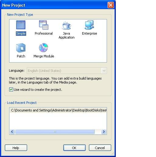
Create a folder on your desktop and drop these two files inside. Fire up advanced installer and select “New Project”

Select the simple project for this.

Once the Wizard fires up, choose and enter both a application name and a company name. The final product will install into a directory like so: Program Files\MyCompany\ApplicationName

OK, now click next and select the folder that you have created on your desktop. Click on next and select where you would like shortcuts placed. These can either be on your desktop or on the start menu or both.

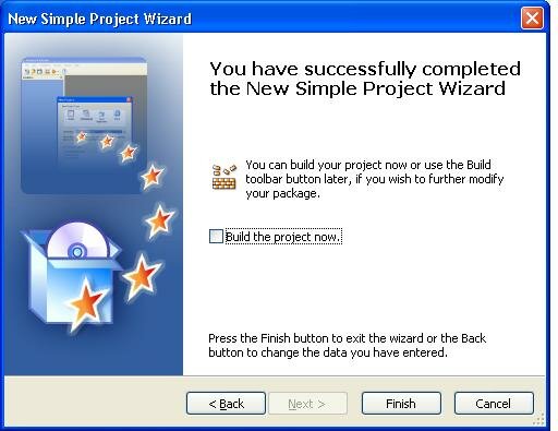
Click next and select Finish. The project will then build itself into an MSI.  However, if you want to get fancy and add an icon to your project, untick the check box labelled “build now”  and click finish.

Now, simply click on the project details on the left hand side of the window and click on the browse button for icons.

Select any icon you like, click on the project menu and then select build. The project will build your MSI with an icon to be easily deployed.

Go ahead and finish setting up tour GPO, and deploy to your workstations.

Slick IT is……

Enjoy!

Bing has arrived.


Glowing blue, Seattle residents were yesterday treated to (or subjected to perhaps) the launch of Microsoft’s highly touted new search engine. The words Bing, glowing brightly on top of the Space Needle, kicked off, what Microsoft says is going to revolutionize our search engine experience. So confident they are of this fact, they have decided that a search engine is to be no longer referred to as a “search engine”, but rather a “decision engine.”

So, my question was, is it all hype?

The answer to that, at least in my mind, is actually fairly clear. Let’s look at this closer so you may decide for yourself.

Microsoft embarked on a research campaign last year trying to figure out what was wrong with search engines (or more precisely – THEIR search engine), looked at these issues in depth and created reports for these. Overwhelmingly, their insight and conclusions seem great. In fact, I would say that they have hit the proverbial nail right on the head. GREAT I’m ready for change! It seems they have discovered what we (Slick IT readers) have known all along – users want their search engine to quit being a pain in the ass.

For example, users want their search engine to actually bring up a hotel’s website when they key in the name of a hotel. They want their search queries to be organized and they want it to actually be related to their query. Why? Because they want to make decisions from this information. They want to decide on a winter vacation. They want to decide on a new pair of boots. They want to decide on a new adult dating website. Everything is about making a decision according to the folks in Redmond.

OK, I agree. That’s probably all true. Instinctively, we are now left with the burning question. How did the makers of Vista accomplish all of this?

Ok, so they have now incorporated “Best Match” technology that “surfaces” the best answer. Secondly, they have “Deep Links” that provide more insight into a search by getting deeper within the site. “Preview” is also a new feature that actually gives a glimpse of the website when you hover over the link. Finally, there is instant answers that will tell you what time your spouse’s flight will arrive just by keying in the flight number.

Well, I have to be honest. I have used Microsoft’s search engine in the past and was presented with what basically amounted to a pile of crap with each and every search so I was curious to see how they had revolutionized it and were going to forever change my life.

My first search query was pretty specific.  I simply keyed in:

http://www.slickit.ca 

And my “Best Match” result:

Result: dog's "lick it up" t-shirt in Gene Simmons Family Jewels in AETV ...

Ok, so that wasn’t quite what I was looking for…maybe it was just a bad example and surely our site will pop up somewhere in the results. Right? Well, I was wrong. After going through three pages of “LINKS”(I thought that we didn’t have to sift through thousands of links in Bing) I still couldn’t find the site.

OK, let’s try again.

boot server 2008

And my results:

Result:Page after page of Microsoft Certification Boot camps.

Hmm, as an IT professional looking for an answer as to why my server won’t boot, I don’t think that this is what I was looking for. Maybe if I was looking for certification boot camps I would have searched for Server 2008 Boot Camps.

Ok, well let’s try a third and final time.

QK 8161 (An Air Canada Flight)

And the result:

Result:Flight 8161 is enroute and on time.

That appeared to work well. It is exactly what I was looking for. But is it revolutionary? Umm, unfortunately not.  Google also delivered the same information on the first hit. Moreover, google was also able to deliver exactly what I was looking for when I seached for my first two queries. In the case of the first one, it provided a link right to our page and in the case of the second query,  it delivered:

Server 2008 Boot Manager - Realtime Windows Server

Again, it delivered exactly the kind of information I would expect when I enter a word included in “computer jargon” with a “piece of a computer system”.  This actually highlights what has always been wrong with the MSN, Live, or now Bing search engines. There appears to be no logic at all applied to collocating words and their connotations to deliver high quality search results. The algorithm has ALWAYS appeared to be flawed to me and Bing seems to follow suit. Fundamentally, I don’t think Microsoft has changed any of the underlying code of their search engine, but rather this is just another attempt to rebrand. The ideas seem nice and I am sure Google will implement some similar features in upcoming updates.

Bing is all hype. I suspect that Google will now remain my default “decision engine” for some time to come.

Thanks for reading this and please feel free to comment below should you disagree. I welcome any remarks!

Windows 7 Release Date Officially Announced

This is going to be short folks, but it is official now. Windows 7 will be coming our way shortly.

The release to manufacturing date will be in the later half of July with the Release to Public date being October 22.

Exciting news!!!


Copyright © 2010 Paul Guenette and Matthew Sleno.