There’s no question that using Windows Explorer is way easier today than it was a decade ago. Particularly with Windows 7, everything just seems to be right where you need it, and there are very few annoyances. Even better for us technical folk, there are more and more helpful tools and features tucked away, just waiting for you to find them.
There is one little oddity, though, that’s remained with Windows – and indeed, pretty much every other OS out there – since the dawn of time. Double-clicking. Now, let’s think about this for a moment. Clearly, a single click is far easier, faster, and friendlier. When you’re working with files, generally you either double-click them (to open) or right-click (to bring up the context menu). Yeah, sure, occasionally you single-click them to select, but let’s set that aside for now, because it’s a far distant third to opening and right-clicking.
Think of browsing the Internet. Every link is a simple click. Just because of that, it’s a far easier thing to work with. Lots of people find Explorer very intimidating, though: left click to select, right click for a menu, click and drag to move (or sometimes copy), right-click and drag to copy (or move or create a shortcut), click and drag in a slightly different way to select files, Control + click or Shift + click to select files in other ways, double click to open, click / wait / click to rename… it goes on and on. People get confused. Hell, I get confused. And yeah, the power is great. I’m not suggesting this functionality be removed. But shouldn’t the most basic operation – a single left click – perform the obvious and usually desired action?
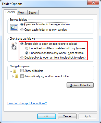
Well, you can make this happen. I’m going to show you a couple of things that have been in Windows for a long, long time, but are pretty much unknown to most people. The first goes all the way back to Windows 95 and the Active Desktop introduced by IE4. Go into Folder Options (ALT + T, O in any Explorer window), and look what we have here:
That’s right… somebody in Microsoft feels the same way I do! Select the ‘Single-click’ option, and choose to underline only when you point at icons (unless you really, really like underlined text all over the place). Click OK, and try browsing files a bit. You’ll notice you can now get around Explorer way faster and way easier. Double-clicking is now a thing of the past!
Of course, there’s one flaw in this change: selecting files. But I have you covered. Go back to Folder Options, click the View tab, and check this out:
Check boxes? Huh?
Well, it works about as you’d expect. Every icon in Explorer will now have a checkbox. Check to select, uncheck to deselect. Of course, you can select the old way at the same time if you prefer. To avoid clutter, checkboxes won’t appear unless they’re checked or until you mouse over them. Here’s how it looks:
As you can see, I have the ‘temp’ and ‘wwwroot’ folders selected, and I have my mouse over ‘history’. I can quickly and easily select a bunch of random files in a list just by clicking the checkboxes. I can still drag-select and use all the other old tricks. There’s even a ‘Select All’ checkbox in the column header.
This works on any view – even the giant thumbnails – and throughout all of Windows. Even the Desktop. Even File Open dialogs. Whether you’re sold on single-click or not, this is very handy. And let’s face it: once you have this, there’s no reason not to use single-click.
Changing Explorer like this will definitely take some getting used to. After all, you’re retraining yourself on one of the most basic parts of using your computer, and changing something very fundamental that has remained unchanged for decades. But I highly recommend you give it a try for a week or two. Once you get used to it, you’ll never go back.


No comments:
Post a Comment